47 years. That is the life expectancy of Sierra Leone, the lowest of all countries. Compare that with the highest life expectancy of 83 years in San Marino. Its easy to brush these numbers aside as another dull statistic, but that is a 36 year difference. I have yet to even experience that length of time! Imagine being told, that your life will end 36 years earlier than expected. It’s not very easy for most of us to comprehend.
I decided to take an initial look at some life expectancy data and visualize the contrast. I used Quandl which is a great open platform for various datasets. I started by gathering Life Expectancy and Health Expenditure data for all world countries. I then generated a plot in R while separating by color the OECD and Non-OECD countries. I highlighted outliers in the plot as well.
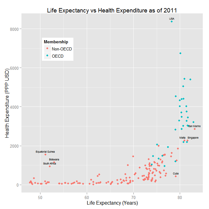
A few things that I noticed immediately:
- Health care spending is vastly unequal between countries and goes up exponentially.
- OECD countries as a whole have a higher life expectancy and spend more on health care than non-OECD countries. In fact, there is an obvious positive relationship between health care expenditure and life expectancy.
- But, money is not the only explanatory factor. Equatorial Guinea, South Africa, and Botswana are 3 African countries that stand out because they can’t “buy more years”.
- The US stands out as another outlier far out-pacing the developed world with private health care, yet there is no apparent benefit in life expectancy. In fact, among OECD countries, the life expectancy is on the low end. In this regards, private health care coverage seems to falter. For a much more in depth analysis see this link.
- By this chart, San Marino, Malta, and Singapore are doing as well as OECD countries – no real surprises there. There are a few other countries as well where the line is blurred between the OECD and non-OECD.
- Cuba has found the secret to long life on a budget. They have a life expectancy higher than USA at literally a fraction of the cost. And, in case you are keeping track, they have universal health care coverage.
- The shape of the graph suggests that initially health care is not a factor in improving life expectancy, but at about 70 years this changes. At this point there is a strong relationship in health care and life expectancy. This lasts until the wall at about 85 years, which will (hopefully?) crumble soon.
I focused further on the last point because I felt this was where the story was hiding. My first concern was what caused the variation in life expectancy from about 45 to 70 when there is little change in health expenditures. There are quite a few other variables to consider that can be driving what is seen above: living standards, environmental improvements, political strife, etc. It is possible that in a lot of these countries malnutrition is a cause of the low life expectancy and the improvement is driven by proper sustenance and clean water. So it could be that increasing health care is less important (and more expensive) than improving agriculture and food distribution. Intuitively, these developing countries should also have a higher rate of birth. I gathered this data from Quandl and plotted the results below with a fitted Loess Curve.
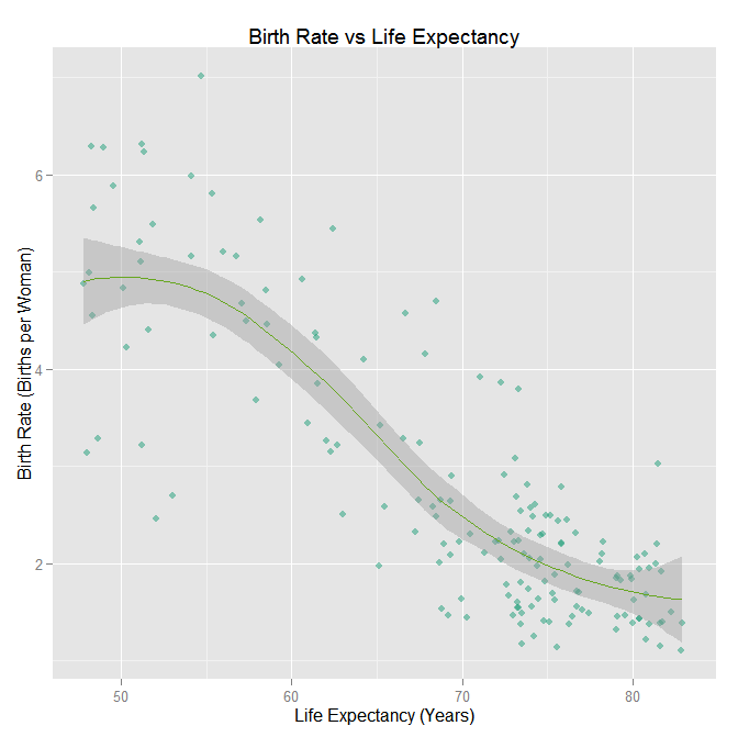
The negative relation between birth rate and life expectancy is quite clear. The missing variable, though, is infant mortality. If birth rate is high and so is infant mortality, then that will drag down on the average life expectancy. An interesting variable to create would be the Life Expectancy given that an individual has survived until a certain age (aka hazard rates). There can be many other stories drawn from the graphs above, but I decided to move on to my new favorite visuals, choropleths.
The initial map is a choropleth with darker blues representing large log health care expenditures. Any country that is white (missing) had missing data. This video imagines that each country has one individual who survives up to the country’s average life expectancy. When the individual is deceased, the country is wiped off the map. The video runs from 47 to 84 years at which point all countries have “disappeared”.
[youtube=http://www.youtube.com/watch?v=wH1UQV9us58&rel=0]
Finally, I found the OECD Better Life Index and Human Development Index to be cool measures of developing countries that incorporates the above data and more.