A week or two ago, Nikhil Kumar showed me this awesome real-time cartogram of twitter feeds. Since it was something I had no idea how to do, I thought it was a good time to learn. I decided to play around with geographical data visualizations and see what kind of graphics could be easily produced.
First, some quick explanations, since I wasn’t familiar with these terms. A cartogram is a map where the area (or distance) is distorted to represent information about some other variable – in the above case, this is the volume of tweets. Another way to represent such data is through the use of choropleths where the areas are colored by the external variable as in this example. There are other ways to demonstrate such data in 3-dimensional space but I focused on cartograms and choropleths.
What I used
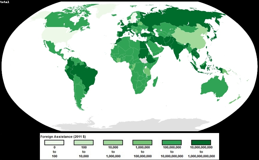
I used US foreign assistance data, both economic and military, from 1946 to 2011 in constant 2011 dollar amounts. I had to remove data that was not properly attributed to a country. Also, there were some other countries that had to be excluded due to conflicts with the map (they didn’t exist at the time the map was produced). The total amount of foreign assistance to all countries (from 1946 to 2011) in 2011 dollars comes out to $2,086,027,401,858 and of this, about 20% was removed from data due to the issues mentioned above. Since the data has such high magnitudes, I decided to log the values to make it easier to deal with. Wiki commons has a world map available which I grabbed for this purpose. Also, I used the fantastic color brewer to make the visuals look good.
And finally the following:
- R – to manipulate dBase files
- Scapetoad – to generate cartograms
- Quantum GIS (QGIS) – to color cartogram shapefiles
- Python (Beautiful Soup and Python Imaging Library) – to parse the SVG file, create a choropleth, and add legend/text to images
- GIMP (and David’s Batch Processor) – to batch convert SVG to JPG
Process – Cartogram
Though the underlying mathematics behind a cartogram is complex, the third party software, Scapetoad, makes it fairly easy to do. First, I had to match up the foreign assistance data to the world map shapefile, specifically the dBase file. This I did in R simply by adding a column to the dBase file with the foreign assistance data. Then, I used Scapetoad to create a cartogram using the modified shapefile.
The process behind creating a cartogram is the Gastner-Newman Diffusion Algorithm. In this case, each country has an area defined by the map and a value for foreign assistance which can combine to give a density variable ($/area). The algorithm works by allowing the “population somehow to ‘flow away’ from high density areas into low-density ones until the density is equalized everywhere”. This can be done via a diffusion process and then applying a Gaussian blur to the density, thus distorting the map.
Scapetoad generated a simple cartogram which I exported to a shapefile and opened with QGIS. Using QGIS, I colored the cartogram also based on the foreign assistance variable to generate the image below. The colors are split by 6 quantiles. The color could have been better utilized to display another variable, such as GDP.
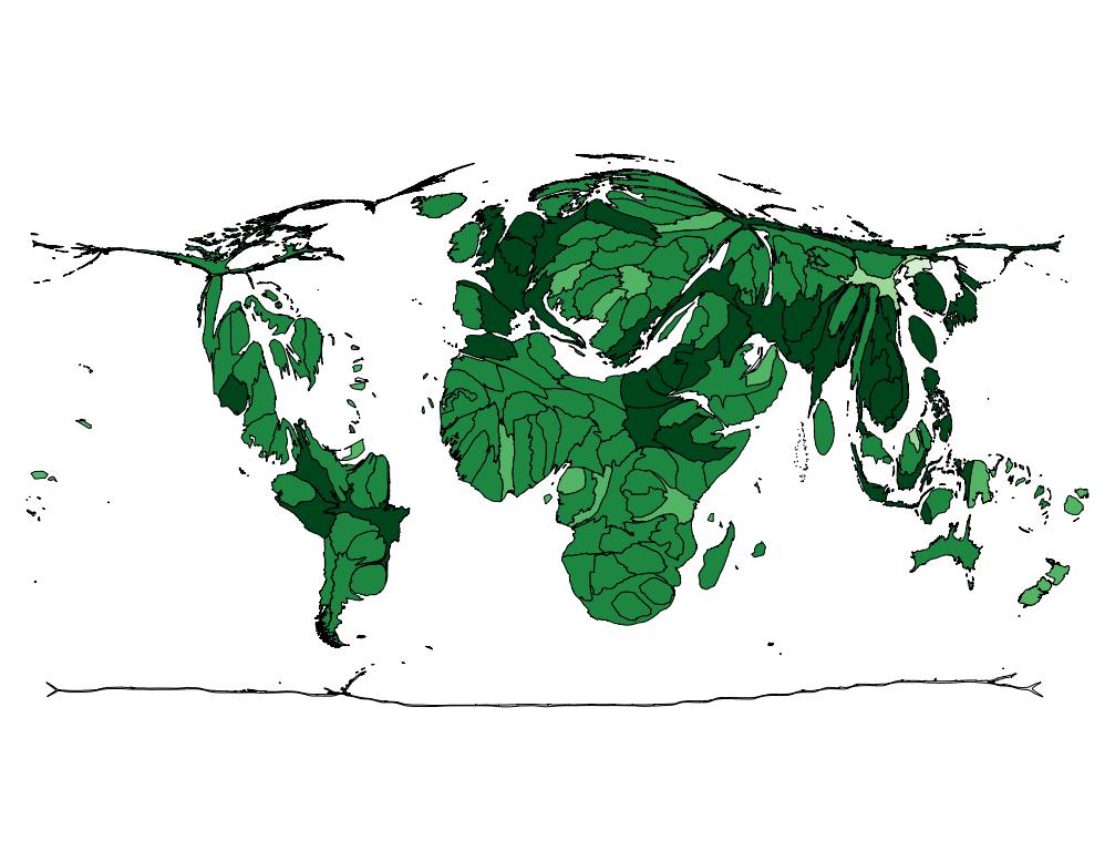
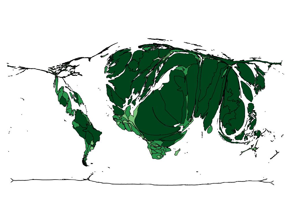
For comparison, here is the version with original data (not logged)
Personally, I didn’t like the look of the cartogram, so I decided to create a choropleth as well.
Process – Choropleth
Since the process behind a choropleth is more intuitive and easy to implement, I did this using Python. This helped when I wanted to run a batch process on every year separately. However, for the purposes of running just one set of data, QGIS actually can handle the work more efficiently and make a prettier end product.
The Python code is fairly straightforward. First, the map is read in as an SVG file and parsed using Beautiful Soup. The foreign assistance data is read in and split into 6 quantiles (same as the color scheme above). Each color change represent a magnitude change of 100x. Since an SVG filed is defined in XML format, a style attribute can be added to each country in the file with the proper fill color. This was run for each year as well as the total to generate a series of SVG image files. I then used GIMP and DBP to convert these files to jpeg format for easier distribution. All files use the same quantiles which were based on total sums from 1946 to 2011, so the yearly files are not as segmented as they could be. Below, is the chart for total foreign assistance which can be compared with the cartograms above.
And I made a quick video of yearly foreign assistance. I gotta learn how to make one of these Economist interactives next…
[youtube=http://www.youtube.com/watch?v=u1xpgWzx1gQ&rel=0]
Really cool stuff man! You should check out http://polymaps.org/
It’d be cool to see this in a web-app!
Awesome link dude. You can make some pretty cool stuff with some of the JS libraries. I was also looking into the google charts API (which does most of the fun part for you). But the real problem is that I have the basic version of wordpress, which doesn’t let you insert your own code. I’d have to host my own site for that. Thanks for sharing!