So far part 2 of this post (Charitable Giving Trends: Part 1), I’ll focus on the tools I used to create these charts. I’ll assume a working knowledge of HTML and CSS, and ignore those parts to get to the fun part of the code. I taught myself JavaScript over the last week or two, so I wouldn’t be surprised if there is ample room for improvement in the code. But I’ll explain everything as a newbie which hopefully will make it easier to follow (and less technical). I used various web resources, and will try to remember the ones I used to help out below.
The charting package I chose to use is D3, which seems to be the most customizable of the JavaScript visualization libraries. So, as expected the D3 script needs to be included before the code below. Also all data sets need to be included, before they are called in the code. We store data as JSON files.
How to produce a scatter plot
Data:
CountryData.js
TextData.js
Resources I used:
Scatterplot example
Scatterplot hover example
To start off, we need a container in our HTML. We include a div with id set to “scatter”, which will be referred to in the code below. Essentially, we use D3 to generate an SVG file (XML for images) on the fly, using the data above. We can also use it to add transformations and animations as needed.
The first step is to set the defaults
var data = countryData;

var width = 800;
var height = 500;
var padding = 50;
var rpadding = 140;
var regions = ["Asia", "Sub Saharan Africa", "Europe", "Latin America", "North Africa", "North America", "Australia"];
var color = d3.scale.ordinal()
    .domain(regions)
    .range(["#1b9e77","#d95f02","#7570b3","#e7298a","#66a61e","#e6ab02","#a6761d"]);
var formatAsPercentage = d3.format("1%");
var formatGDP = d3.format(",.0f");

var defx = "HelpingAStrangerPct";
var defy = "LogGDP";

var xLabel = "Helped a stranger in past month (%)";
var yLabel = "Log of GDP (PPP) per capita ($)";
Line 1 defines our data source from the JSON file included above. The width, height and padding is set. Line 7 defines a list of regions which we use in the following line to map to a range of colors. The key to D3 is being able to map a domain to a range. In lines 8 – 10, the domain is the ordinal set of region names and the range is a set of colors (chosen from color brewer). The next two lines are formatting for numbers in our chart. Line 14 & 15 are the headings from out table (as defined in the CountryData.js file) that the chart displays. Finally, the default labels for the axes can be found in lines 17 & 18.
var x = d3.scale.linear().domain([d3.min(data, function(d) { return parseFloat(d[defx]); }), d3.max(data, function(d) { return parseFloat(d[defx]); })])
	.range([padding, width-rpadding]);
var y = d3.scale.linear().domain([d3.min(data, function(d) { return parseFloat(d[defy]); }), d3.max(data, function(d) { return parseFloat(d[defy]); })])
	.range([height-padding, padding]);
The best way to visualize what we are doing is to imagine the computer as a sheet of graph paper, where each pixel is a unit. The top left corner of the div, which we defined, is (0,0) while the bottom right corner is (800, 500) as determined by the defaults above. Notice that the y-axis here is actually reversed, as in larger numbers are lower. Here is an example image of our div based on the defaults (not to scale). The div is the entire framed box. The x and y values on the outside are calculated from our width, height and padding. The mapping domain is in red and range is in yellow.
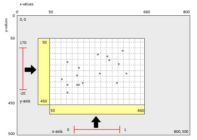
In the code above, we use D3’s mapping function. The mapping is a linear transform from our data set to the our axes. The minimum and maximum functions are used on the dataset to iterate and return the values for each set. So, in the example image, if the x values range from 0 to 1, the mapping transforms the values between 50 and 660. These values can now be used directly to color specific pixels.
var xAxis = d3.svg.axis()
    .scale(x)
    .orient("bottom");
var yAxis = d3.svg.axis()
    .scale(y)
    .orient("left");
Here, we create the axes, but the formatting is done later.
var div = d3.select("body").append("div")
    .attr("class", "tooltip")
    .style("opacity", 0);
We, programmatically, add a tooltip div that starts completely transparent. This will appear (and disappear) as the mouse hovers overs points. But, that bit of the code comes later.
var scatter = d3.select("#scatter")
    .append("svg:svg")
    .attr("width", width)
    .attr("height", height);
The canvas is added to the DOM so we can finally create the pieces as shown in the image above. Notice how we refer to the div by its id: “#scatter”.
scatter.selectAll("circle")
    .data(data)
    .enter()
    .append("svg:circle")
    .attr("cx", function(d) { return x(d[defx]); })
    .attr("cy", function(d) { return y(d[defy]); })
    .attr("r", 4)
	.style("fill", function(d) { return color(d.Continent); })
	.on("mouseover", function(d) {
		d3.select(d3.event.target).classed("highlight", true);
        div.transition()
			.duration(800)
            .style("opacity", .9);

        div.html(d.Country + "<br/>GDP: $" + formatGDP(Math.pow(10,d.LogGDP)))
            .style("left", (d3.event.pageX) + "px")
            .style("top", (d3.event.pageY - 48) + "px");

	var circle = d3.select(this);

	// transition to increase size/opacity of bubble
		circle.transition()
			.duration(800).style("opacity", 1)
			.attr("r", 8).ease("elastic");

		scatter.append("g")
			.attr("class", "guide")
			.append("line")
			.attr("x1", circle.attr("cx") - 40)
			.attr("x2", circle.attr("cx") - 40)
			.attr("y1", circle.attr("cy") - 20)
			.attr("y2", height - 70)
			.attr("transform", "translate(40,20)")
			.style("stroke", circle.style("fill"))
			.transition().duration(800).styleTween("opacity",
						function() { return d3.interpolate(0, .5); });

		scatter.append("g")
			.attr("class", "guide")
			.append("line")
			.attr("x1", circle.attr("cx") - 40)
			.attr("x2", 10)
			.attr("y1", circle.attr("cy") - 30)
			.attr("y2", circle.attr("cy") - 30)
			.attr("transform", "translate(40,30)")
			.style("stroke", circle.style("fill"))
			.transition().duration(800).styleTween("opacity",
						function() { return d3.interpolate(0, .5); });
        })
    .on("mouseout", function(d) {
        div.transition()
            .duration(500)
            .style("opacity", 0);
		var circle = d3.select(this);

		// go back to original size and opacity
		circle.transition()
			.duration(800).style("opacity", 0.7)
			.attr("r", 4).ease("elastic");

		d3.selectAll(".guide").transition().duration(100).styleTween("opacity", function() { return d3.interpolate(.5, 0); })
			.remove()
	});
This large chunk of code is used to draw the points. In lines 43 to 46, we select the canvas, choose the data we will use, and append circles. The attributes of a circle are its center point (cx, cy) and radius (r) as defined in lines 47 to 49. Notice that we are using the mappings defined previously to set the center of each circle. In line 50, we use the color mapping to fill in the points’ colors.
The next part of the code (from line 51) determines what happens on mouse over. Ignore line 52 as that is deprecated code. Line 53 to 55 demonstrates our fast transition function. Here the div variable (the tooltip from above) is made to appear (by changing opacity from 0 to 0.9) over 800 milliseconds. In the next few lines, the div variable is also given html to display the country name & GDP. Lines 58 to 59 determine where the tooltip appears compared to our mouse. In line 61, we create a variable of the circle object which we refer to next. Lines 64 to 66 is a transition for the circle to increase its radius and opacity. Lines 68 to 91 draw the guidelines from the circle. All this happens, when we hover our mouse over a circle. We also want to undo all these actions when the mouse leaves the circle.
In lines 92 to 105, we do just that by making the tooltip transparent (opacity 0), shrinking the circle and returning to its default opacity, and removing the guidelines. You may have noticed that we never defined the default circle opacity in the code above and you would be correct. That is determined in the CSS file.
We add the finishing touches.
scatter.selectAll("rect")
	.data(regions)
	.enter().append("rect")
	.attr({
		  x: width - 100,
		  y: function(d, i) { return (160 + i*20); },
		  width: 15,
		  height: 12
	})
	.style("fill", function(d) { return color(d); });

scatter.selectAll("text")
	.data(regions)
	.enter().append("text")
	.attr({
		x: width - 80,
		y: function(d, i) { return (172 + i*20); },
	})
	.style("font-size", "9px")
	.text(function(d) { return d; });


scatter.append("g")
	.attr("class", "xaxis")
    .attr("transform", "translate(0," + (height - padding) + ")")
    .call(xAxis)
	.append("text")
    .attr("class", "xlabel")
    .attr("x", 450)
    .attr("y", 32)
    .style("text-anchor", "end")
    .text(xLabel);

scatter.append("g")
    .attr("class", "yaxis")
    .attr("transform", "translate(" + padding + ",0)")
    .call(yAxis)
	.append("text")
    .attr("class", "ylabel")
    .attr("transform", "rotate(-90)")
    .attr("y", -40)
    .attr("dy", ".71em")
	.attr("x", -150)
    .style("text-anchor", "end")
    .text(yLabel);
Finally, we can manipulate the legend and axes. By now, most of these functions should be familiar and at least understandable as to what they are doing. Line 108 to 117 draws the colored rectangles we see on the legend. Notice that the data set being used is now regions and not the CountryData.js from above. Lines 119 to 127 write out the text we see next to the rectangles in the legend. If you are wondering how every number is determined… trial and error, until I found something that looked as I wanted. But if you ever get lost in the process, just go back the basics and think in terms of our graph paper.
The x-axes and y-axis are created from lines 130 to 152. All this code creates the basic scatter plot. So how did I have the graph update with new data? The trick to that is simply to read in the new data, apply the mappings, and update the circles and axes in the chart. Feel free to give that a shot or just check the code below. You can also get all the code the standard way in any browser by searching the source files. Hope it helps!
Update scatter chart
function updateData() {
	var newx = document.getElementById("xSelect").value;
	var newy = document.getElementById("ySelect").value;
	var xIndex = document.getElementById("xSelect").selectedIndex;
	var yIndex = document.getElementById("ySelect").selectedIndex;

	// Scale the range of the data again
    var x = d3.scale.linear().domain([d3.min(data, function(d) { return parseFloat(d[newx]); }), d3.max(data, function(d) { return parseFloat(d[newx]); })]).
		range([padding, width-rpadding]);
	var y = d3.scale.linear().domain([d3.min(data, function(d) { return parseFloat(d[newy]); }), d3.max(data, function(d) { return parseFloat(d[newy]); })]).
		range([height-padding, padding]);

	var xAxis = d3.svg.axis().
		scale(x).
		orient("bottom");
	var yAxis = d3.svg.axis().
		scale(y).
		orient("left");

    // Select the section we want to apply our changes to
    var scatter = d3.select("#scatter");

    // Make the changes
    scatter.selectAll("circle")
		.data(data).transition()
		.attr("cx", function(d) { return x(d[newx]); })
		.attr("cy", function(d) { return y(d[newy]); })
		.duration(1000)
		.delay(100);

	scatter.select("g.xaxis")
		.transition().duration(1000)
		.delay(100)
		.call(xAxis);
	scatter.select("g.yaxis")
		.transition().duration(1000)
		.delay(100)
		.call(yAxis);
	scatter.select("g.xaxis")
		.select("text.xlabel").text(labelData[xIndex]);
	scatter.select("g.yaxis")
		.select("text.ylabel").text(labelData[yIndex]);

}
Pie chart
var widthpie = 900,
    heightpie = 500,
    radius = Math.min(widthpie, heightpie) / 2;

var formatAsPercentage = d3.format("1%");

var color = d3.scale.ordinal()
    .range(["#8dd3c7","#ffffb3","#bebada","#fb8072","#80b1d3","#fdb462","#b3de69","#fccde5","#d9d9d9","#bc80bd","#ccebc5"]);

var arc = d3.svg.arc()
    .outerRadius(radius - 10)
    .innerRadius(0);

var pie = d3.layout.pie()
    .sort(null)
    .value(function(d) { return d.Amount; });

var svg = d3.select("#pie").append("svg")
    .attr("width", widthpie)
    .attr("height", heightpie)
    .append("g")
    .attr("transform", "translate(" + widthpie / 2 + "," + heightpie / 2 + ")");

var datapie = [
	{
		"Recipient": "Religion",
		"Amount": "95.88"
	},
	{
		"Recipient": "Education",
		"Amount": "38.87"
	},
	{
		"Recipient": "Gifts to Foundations",
		"Amount": "25.83"
	},
	{
		"Recipient": "Human Services",
		"Amount": "35.39"
	},
	{
		"Recipient": "Public-Society Benefit",
		"Amount": "21.37"
	},
	{
		"Recipient": "Health",
		"Amount": "24.75"
	},
	{
		"Recipient": "International Affairs",
		"Amount": "22.68"
	},
	{
		"Recipient": "Arts, Culture & Humanities",
		"Amount": "13.12"
	},
	{
		"Recipient": "Environment & Animals",
		"Amount": "7.81"
	},
	{
		"Recipient": "Foundation Grants to Individuals",
		"Amount": "3.75"
	},
	{
		"Recipient": "Unallocated",
		"Amount": "8.97"
	}
];

var div = d3.select("body").append("div")
    .attr("class", "tooltip2")
    .style("opacity", 0);

datapie.forEach(function(d) {
    d.Amount = +d.Amount;
});

var g = svg.selectAll(".arc")
    .data(pie(datapie))
    .enter().append("g")
    .attr("class", "arc");

g.append("path")
    .attr("d", arc).style("opacity", 1)
    .style("fill", function(d) { return color(d.data.Recipient); })
	.on("mouseover", function(d) {
		div.transition()
        .duration(200)
        .style("opacity", .9);

        div.html(d.data.Recipient + "<br>$" + d.data.Amount + " billion<br>" + formatAsPercentage(d.data.Amount/298.42))
        .style("left", (d3.event.pageX) + "px")
        .style("top", (d3.event.pageY - 48) + "px");

		var path = d3.select(this);

		path.transition()
		.duration(200).style("opacity", .5);
	})
	.on("mouseout", function(d) {
        div.transition()
        .duration(500)
        .style("opacity", 0);

		var path = d3.select(this);

		// go back to original size and opacity
		path.transition()
		.duration(200).style("opacity", 1)
	});

g.append("text").attr({
		x: widthpie - 600,
		y: function(d, i) { return (-82 + i*20); },
	})
	.style("font-size", "9px")
	.text(function(d) { return d.data.Recipient; });

svg.selectAll("rect")
	.data(datapie)
	.enter().append("rect")
	.attr({
		x: widthpie - 620,
		y: function(d, i) { return (-92 + i*20); },
		width: 15,
		height: 12
	})
	.style("fill", function(d, i) { return color(d.Recipient); });